# UX Documents
Quick app pages, components and custom elements are defined in documents with a specific UX format. These documents, identified by the extension .ux, encapsulate the structure, logic and rendering information of pages and components.
UX documents include three main sections:
- Template. Identified by the
<template>tag, this section specifies the structure of the component or page, including rendering information (i.e., content and visual elements) and logic (i.e., conditionals, loops,..). More information in the templates section. - Stylesheet. Identified by the
<style>tag, this section includes the local stylesheets to be applied to the component or page. More information in the styling section. - Scripts. Identified by the
<script>tag, this section defines the functions and the business logic of the component or page, including the management of their lifecycle. More information in the scripting section.
NOTE
The reserved app.ux in the root of the package defines the common data and logic of the app, affecting all the pages globally.
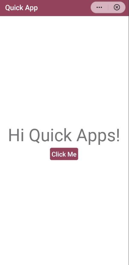
Example of an UX file:
<template>
  <div class="container">
    <text class="title">Hi Quick Apps!</text>
    <input class="input-button" type="button" value="Click Me" onclick="click"/>
  </div>
</template>

<style>
  .container {
    flex-direction: column;
    justify-content: center;
    align-items: center;
  }
  .title {
    font-size: 100px;
  }
  .input-button {
    padding: 5px 10px 5px 10px;
    margin-top: 10px;
    border-radius: 10px;
    color: #ffffff;
    background-color: #95445C;
  }
</style>

<script>
  module.exports = {
    data: {
      componentData: {},
    },
    onInit() {
      this.$page.setTitleBar({
        text: 'Quick App',
        textColor: '#ffffff',
        backgroundColor: '#95445C'
      });
    },
    click() {
      console.log('On click event!!')
    }
  }
</script>
Producing the following result:
# app.ux
The app.ux document in the root of the package configures the global methods, data, and styles of the app. These global resources of this document will be accessible from any page and component of the app. Styles and scripts defined and imported in app.ux will take effect globally.
The content defined in the app.ux document can be accessed from the ViewModel, through this.$app.$def.
WARNING
After the compilation process, the app.ux file contains the configurations defined in the manifest. Therefore, do not delete the comment tag /manifest/, included automatically.