# switch
Form input acting as a toggle switch.
# Children Elements
This element doesn't support children elements.
# Attributes
In addition to the common attributes, this element may contain the following attribute.
# checked
This attribute indicates the status of the switch (checked or not). The CSS :checked pseudo-class is related with the value of this attribute.
- Type:
boolean - Default value:
false - Mandatory: no
# CSS Properties
In addition to the common styles, this element supports the following styling properties:
This element supports the :active pseudo-class.
# thumb-color
Color of the switch button.
- Type:
<color> - Default value: -
- Mandatory: no
# track-color
Color of the track of the switch (background).
- Type:
<color> - Default value: -
- Mandatory: no
# Events
This element supports the common events and the following event:
# change
This event is triggered when the current value of a switch changes.
Additional parameters:
{ checked: boolean }
# Methods
This element does not have additional methods.
# Example
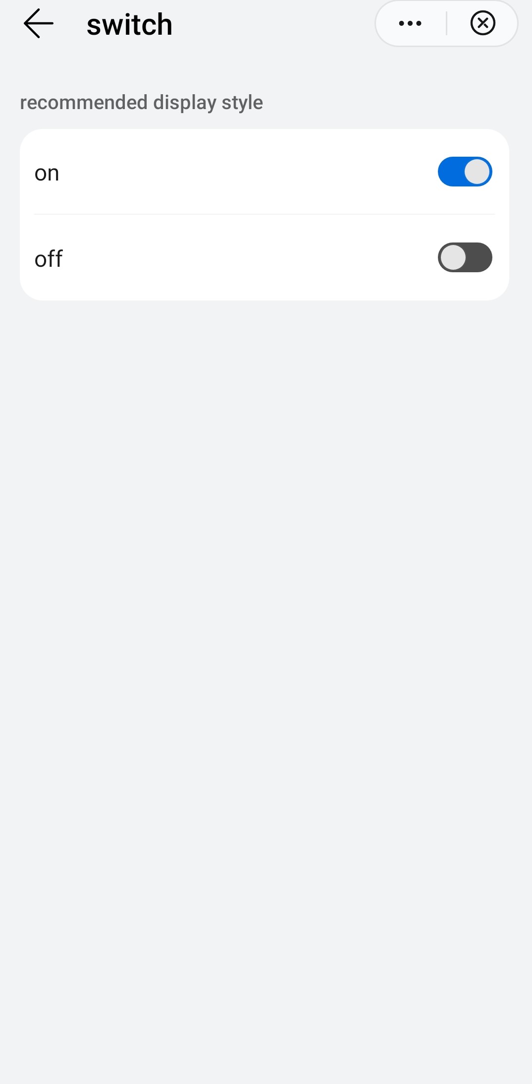
<template>
  <div class="container">
    <div class="case-title mt-item">
      <text class="title">Recommended display style</text>
    </div>
    <div class="info-container">
      <div class="info-item border-bottom-1">
        <label class="title">on</label>
        <div class="result">
          <switch checked="true"></switch>
        </div>
      </div>
      <div class="info-item">
        <label class="title">off</label>
        <div class="result">
          <switch></switch>
        </div>
      </div>
    </div>
  </div>
</template>