# slot
Represents a placeholder for distributing content in child components. This element is similar to the slot HTML templating element (opens new window).
# Children Elements
slot elements may have any children elements.
# Attributes
This element may contain the following attribute:
# attribute
Name of a slot.
- Type:
string - Default value:
default - Mandatory: no
If the element has the name attribute set up, it is called a named slot.
# Usage
You can use the slot element to define a placeholder inside a component and fill it in with content from other component.
We can create the template with specific markup, and include a placeholder with slot.
<!-- detail.ux template -->
<template>
  <div>
    <slot></slot>
  </div>
</template>
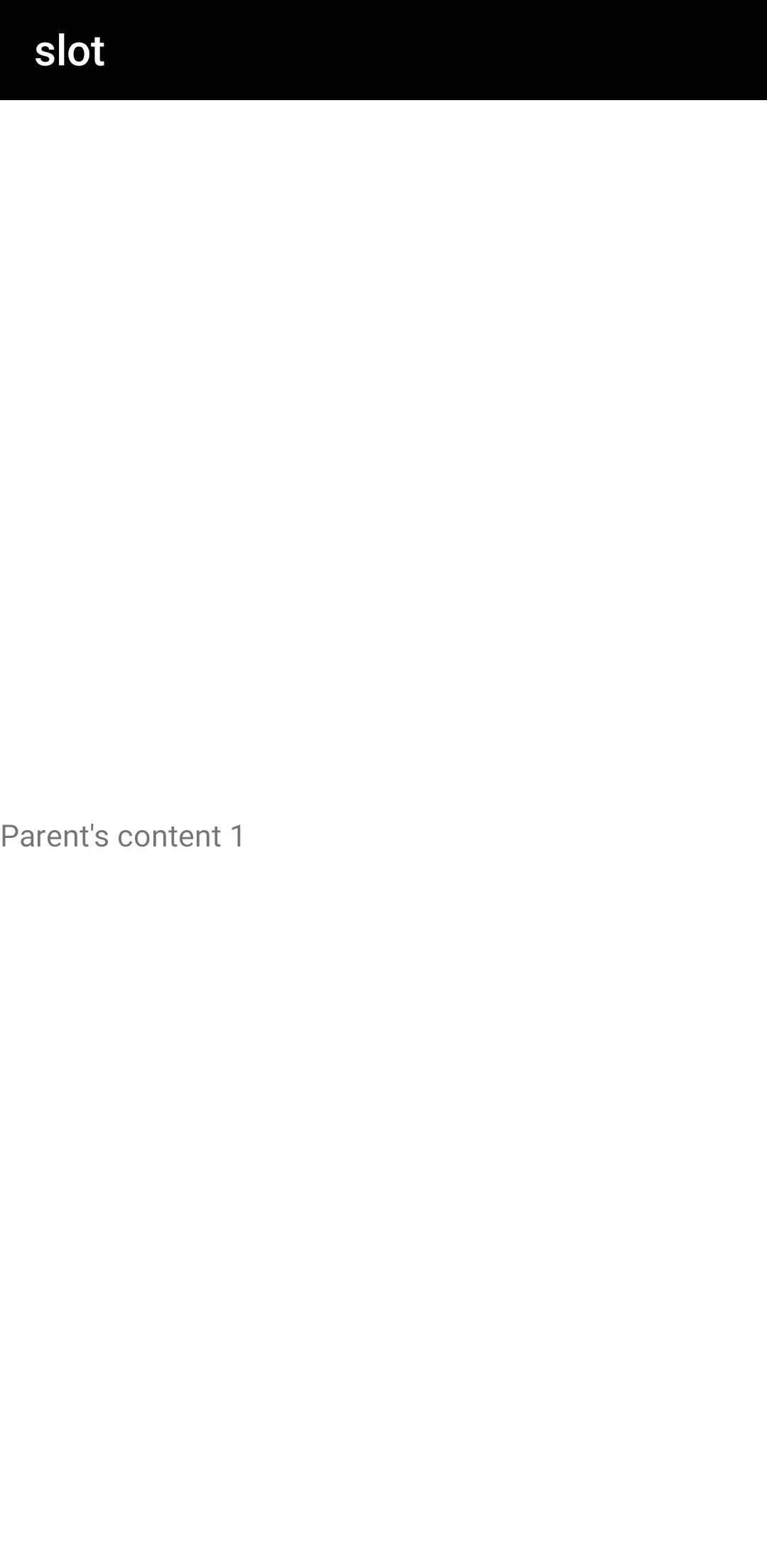
We can include the previous detail.ux template as a child of another component main.ux and distribute the content.
<!-- main.ux template -->
<import name="detail" src="./detail.ux"></import>
<template>
  <div>
    <detail>
      <text>Parent's content 1</text>
    </detail>
  </div>
</template>
The two DOM trees will be presented together during the rendering process.
# Content by Default
You can include content by default in the slot element. This will be shown in case no value is defined by the parent.
<!-- detail.ux template -->
<template>
  <div>
    <slot>
      <text>Default content in the child component</text>
    </slot>
  </div>
</template>
<!-- main.ux template -->
<import name="detail" src="./detail.ux"></import>
<template>
  <div>
    <detail>
    </detail>
  </div>
</template>
With the following result:
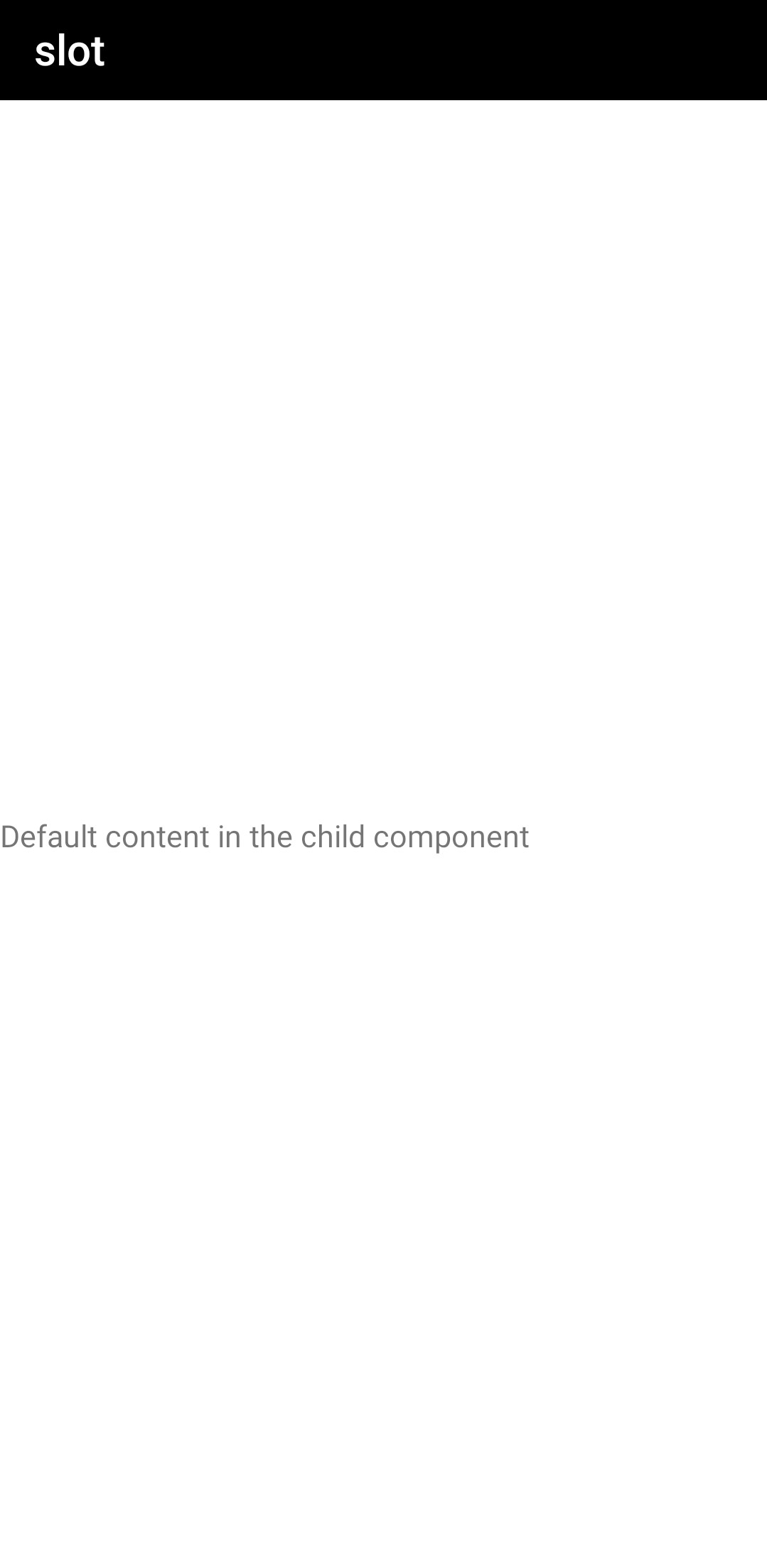
When the content is not distributed to the children templates, the value by default will be rendered with the content by default.
The following example renders the value by default.
<!-- main.ux template -->
<import name="detail" src="./detail.ux"></import>
<template>
  <div>
    <detail>
        <text if="{{showContent}}">Dynamic content that may be shown...</text>
    </detail>
  </div>
</template>
<script>
export default {
  data() {
    return {
      showContent: false
    }
  }
}
</script>
With this result:
# Named Slot
In a component, slot elements with different names to refer to them from the external. If name is not set, default is used.
<!-- detail.ux template -->
<template>
  <div>
    <div class="header">
      <!-- Put the header here. -->
      <slot name="header"></slot>
    </div>
    <div class="main">
      <!-- Put the body here. -->
      <slot name="main"></slot>
    </div>
    <div class="footer">
      <!-- Put the footer here. -->
      <slot name="footer"></slot>
    </div>
  </div>
</template>
In the parent element, set the slot attribute. If it is not set, default is used. Then, the content is distributed to the corresponding slot element.
<!-- main.ux template -->
<import name="detail" src="./detail.ux"></import>
<template>
  <div>
    <detail>
      <text slot="header">header content</text>
      <text slot="main">main content</text>
      <text slot="footer">footer content</text>
    </detail>
  </div>
</template>