# progress
Progress indicator.
# Children Elements
This element doesn't support children elements.
# Attributes
In addition to the common attributes, this element may contain the following attributes.
# percent
This attribute indicates the value of the progress as a percentage.
- Type:
number - Default value:
0 - Mandatory: no
TIP
This attribute is invalid when type is circular.
Decimal values will be rounded off to integers.
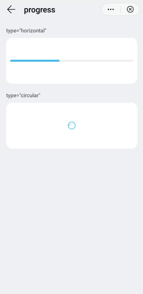
# type
Type of the progress bar.
- Type:
string(horizontal|circular) - Default value:
horizontal - Mandatory: no
WARNING
The value of this attribute cannot be modified dynamically.
# CSS Properties
In addition to the common styles, this element supports the following styling properties:
This element supports the :active pseudo-class.
# color
Color of the progress bar.
- Type:
<color> - Default value:
#33b4ff - Mandatory: no
# stroke-width
Width of a horizontal progress bar.
- Type:
<length> - Default value:
32px - Mandatory: no
# layer-color
Background color of a progress bar.
- Type:
<color> - Default value:
#f0f0f0 - Mandatory: no
TIP
- For a
horizontalprogress bar, the background color by default is#f0f0f0. - For a
circularprogress bar, thewidthandheightare32pxby default. If thewidthandheightare different, the smaller value will be applied to both properties. - To set the width of a progress bar, you should place the
progresselement into adivelement and set thediv's width.
# Events
This element support all the common events, with the exception of swipe.
# Methods
This element does not have additional methods.
# Example
<template>
  <div class="container">
    <div class="case-title mt-item">
      <text class="title">type="horizontal"</text>
    </div>
    <div class="item-container">
      <div class="progress-box row-center">
        <progress percent="40" class="horizontal-progress"></progress>
      </div>
    </div>
    <div class="case-title mt-item">
        <text class="title">type="circular"</text>
      </div>
    <div class="item-container">
      <div class="progress-box row-center column-center">
        <progress type="circular" class="circular-progress"></progress>
      </div>
    </div>
  </div>
</template>

<style lang="sass">
  .progress-box {
    width: 100%;
    height: 200px;
    flex-direction: column;
  }
  .horizontal-progress {
    stroke-width: 10px;
  }
  .circular-progress {
    width: 70px;
    height: 70px;
  }
</style>