# popup
Displays a tooltip text on an element.
The content in the pop-up element is a text specified as a child node.
# Children Elements
This element only supports text elements elements as children nodes.
# Attributes
In addition to the common attributes, this element may contain the following attributes.
# target
This attribute identifies the target element (its id) where the pop-up will be shown.
- Type:
string - Default value: -
- Mandatory: yes
# placement
This attribute defines the position of the pop-up.
- Type:
string(left|right|top|bottom|topLeft|topRight|bottomLeft|bottomRight) - Default value:
bottom - Mandatory: no
# CSS Properties
In addition to the common styles, this element supports the following styling property:
# mask-color
Color of the overlay mask.
- Type:
<color> - Default value:
#000000 - Mandatory: no
TIP
If the value is not specified, the mask will be completely transparent.
If only the color is specified, the opacity is set to 30% by default.
# Events
In addition to the common events (with the exception of appear and disappear, this element supports the following event:
# visibilitychange
This event is triggered when a pop-up becomes visible or hidden.
Additional parameters:
{ visible: boolean }
# Methods
This element doesn't support additional methods.
# Example
<template>
<div class="container column-center row-center">
<div class="mlr-container">
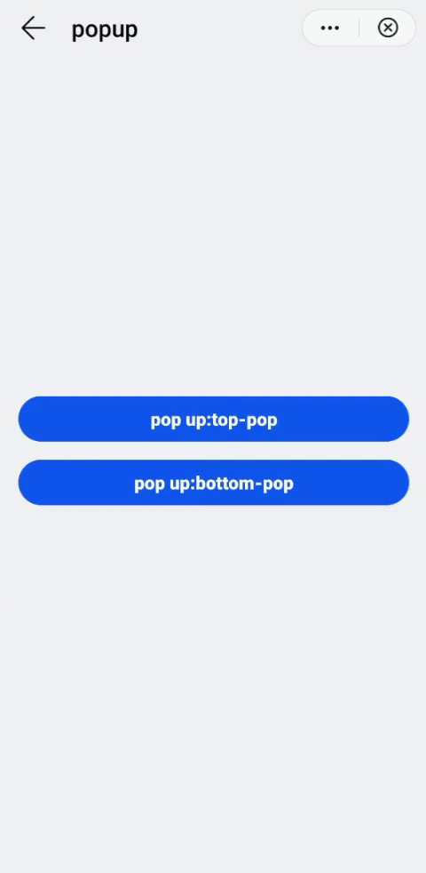
<input type="button" value="pop up:top-pop" class="btn-blue" id="pop-top"/>
</div>
<div class="mlr-container mt-btn">
<input type="button" value="pop up:bottom-pop" class="btn-blue" id="pop-bottom"/>
</div>
<popup target="pop-top" placement="top" style="mask-color: #333333;">
<text>top</text>
</popup>
<popup target="pop-bottom" style="mask-color: #333333;">
<text>bottom</text>
</popup>
</div>
</template>
<script>
module.exports = {
}
</script>