# list-item
Functions as a sub-element of list to define specific items in a list.
# Children Elements
Any children elements allowed.
# Attributes
In addition to the common attributes, this element may contain the following attributes.
# type
Type of a list-item element. A list supports multiple types of list items.
- Type:
string - Default value: -
- Mandatory: yes
Same type list-items shall have the same view layout after being rendered. When the type is fixed, use the show attribute to override the if attribute to ensure that the view layout remains unchanged.
WARNING
Use if and for properly in list-item. They may cause inconsistent DOM structures and rendering errors in list-items of the same type.
# CSS Properties
In addition to the common styles, this element supports the following styling properties:
# column-span
Number of columns used by a list-item element in a list. This parameter is used when a list contains multiple columns.
- Type:
integer - Default value:
1 - Mandatory: no
The width and height of list-item and its sub-elements must be specified in fixed units (e.g., 200 px), and it may be equal to or larger than its parent list element's width.
:::
Usually, the value of column-span must be less than or equal to the parent list's columns value. The list element supports the layout-type style. The options are stagger and grid (by default).
- When
layout-typeis set tostagger, if the value oflist-item'scolumn-spanis equal to the value oflist'scolumns, items are distributed in all the columns. Otherwise, thelist-itemelement is displayed ascolumn-span: 1. - If
layout-typeisgrid(or not set up), and the value oflist-item'scolumn-spanis less than or equal to its parentlist'scolumnvalue, it will use the column width specified bycolumn-span. Otherwise, thelist-itemelement is displayed ascolumn-span: 1. :::
# Events
Apart from the common events, this element does not support additional events.
# Methods
This element does not have additional methods.
# Example
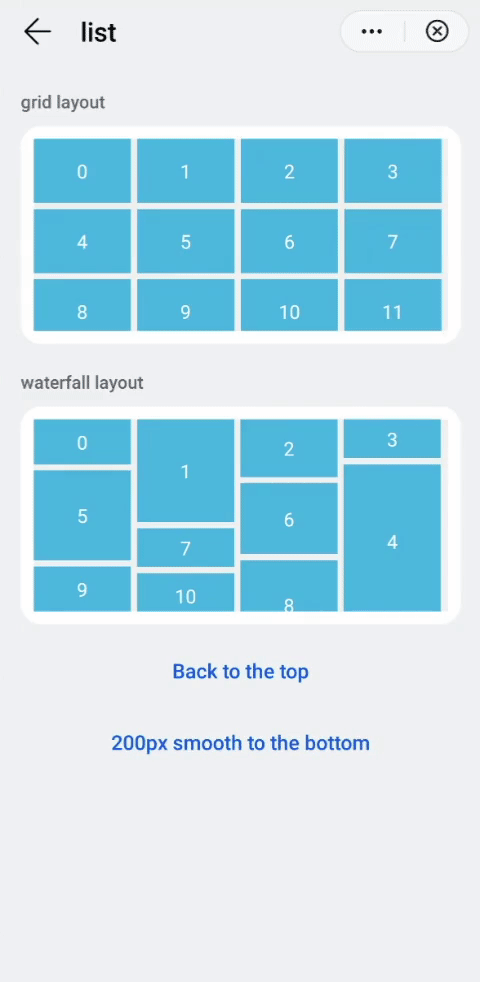
<template>
  <div class="container">
    <div class="case-title mt-item">
      <text class="title">grid layout</text>
    </div>
    <div class="item-container">
      <list class="list grid" onscrollbottom="gridScrollBottom" id="list">
        <list-item class="list-item bg-blue" type="grid" for="(index,gridItem) in list1">
          <text class="color-white">{{index}}</text>
        </list-item>
        <list-item class="list-item" type="grid">
          <progress class="progress" type="circular"></progress>
        </list-item>
      </list>
    </div>
    <div class="case-title mt-item">
      <text class="title">waterfall layout</text>
    </div>
    <div class="item-container">
      <list class="list stagger" onscrollbottom="staggerScrollBottom" id="listStagger">
        <list-item class="list-item bg-blue" style="height:{{gridItem.height}}px;" type="stagger" for="(index,gridItem) in list2">
          <text class="color-white">{{index}}</text>
        </list-item>
        <list-item class="list-item" type="stagger">
          <progress class="progress" type="circular"></progress>
        </list-item>
      </list>
    </div>
    <div class="row-center mt-btn">
      <text class="btn-transparent" onclick="scrollTop">Back to the top</text>
    </div>
    <div class="row-center mt-btn">
      <text class="btn-transparent" onclick="scrollDown">200px smooth down</text>
    </div>
  </div>
</template>
See the complete example in list.